October 18, 2010

yU+co. Re-teams With Director Davis Guggenheim On ''Waiting For Superman'' Main-On-End Title Sequence

HOLLYWOOD, CA -- Throughout the course of ''Waiting for Superman,'' the new documentary directed by Davis Guggenheim (''An Inconvenient Truth''), viewers are taken on emotional rollercoaster courtesy of the heart-wrenching case histories of five different families across the country struggling to give their kids a shot at a better education. When it came to the main-on-end title sequence though, Guggenheim entrusted yU+co, the design/visual effects studio led by Founder/Creative Director Garson Yu, to leave the audience with just one lasting impression: hope.

''Garson and I knew we needed more in the end titles than inspirational words -- we were searching for a metaphor that moved the audience at the end to action,'' Guggenheim says. ''Somehow we landed on the idea that a great school is a beating heart -- and when it works -- it pumps life into a neighborhood. Garson and his team took this idea and ran with it. It's everyone's favorite moment -- a school giving life to the world around it, capturing the hope of the filmmakers and inspiring the audience.''

Following on the heels of their successful collaboration on the Academy Award-winning ''An Inconvenient Truth'' (2006), the ''Waiting For Superman'' titles feature a gracefully moving string of connective typography underscored by a series of animated blue lines.

Set to the powerful track ''Shine'' by John Legend, key title credits are interwoven with an impassioned cry for help: ''Our system is broken and it feels impossible to fix, but we can’t wait. Text ‘possible’ to 77177,'' the typography reads. As the titles progress so do the complexity of the animated blue lines.

The sequence builds toward a breathtaking and unexpected payoff with the final on-screen type: ''Great schools won’t come from winning the lottery. They won’t come from Superman. They will come from you.'' The last word ‘you’ fades slowly into the background as the camera swiftly pans backward and quickly skyward. A golden shaft of light reveals that the blue lines seen throughout have formed a large, 3D animated blueprint of a school and a community connected to it.

''The idea was to let the audience take all of this information and transfix them with this peaceful, elegant moving type of connecting words set to this inspiring song,'' Yu says. ''We also incorporated subtle uses of light -- particularly cool blue and warm gold -- to further symbolize the idea of positive change.''

The ultimate compliment comes from the film’s Producer Lesley Chilcott, who views the title sequence as literally the end of the film, not something separate. ''It's part of the film,'' Chilcott says. ''We've screened the film all over the country, and people stay and watch yU+co'.s beautiful 3D animation. The titles are simply breathtaking.''

Chilcott continues, ''We intercut our production credits with little poems about how and why you can get involved. If the film has done it's job, the audience is very emotional at the end, and the poems we wrote, along with the beautiful design gives people choices on how to get more involved.''

For Yu the project was a personal one. ''I have a son who is a senior in public high school and the problems the film highlights are very real, but they are within our power to fix as a nation,'' Yu says. ''Our goal was to communicate an overall hopeful feeling and deliver a call to action for all of us to do something to change the status quo.''

In addition to their work on ''Waiting for Superman,'' yU+co. also completed work on the titles for the Warner Bros. romantic comedy ''Life As We Know It'' and for the second year in a row created the full graphics package for NBC’s recent broadcast of the 62nd Annual Emmy Awards. In addition, they created the open for the live event launch conference of LG’s Optimus smartphones.


About yU+co: 
Recognized as an industry leader in visual design and motion graphics with offices in Hollywood, Hong Kong, and Shanghai, yU+co. (www.yuco.com) specializes in main and end titles for film and television, visual effects, TV show opens and network graphics packages, theatrical logos, game cinematics and commercials. For more information contact Director of Business Development Dianna Costello (323-606-5050, dianna@yuco.com).


Web Resources:
Click here to watch the Waiting For Superman title sequence:
http://www.yuco.com/projects/waiting-for-superman

Click here for more info about yU+co:
http://yuco.com

Click here for more info about Waiting for Superman:
http://www.waitingforsuperman.com/


Creative Credits:
Project: ''Waiting for Superman'' main-on-end title sequence

Design/Visual Effects: yU+co - Hollywood, CA
Creative Director: Garson Yu
Executive Producer: Carol Wong
Producer: Sarah Coatts
Coordinator: Ryan Wilk
Designers/Animators: Edwin Baker, Etsuko Uji, Kaya Thomas, Kina Choi, Osamu Shishime, John Kim, Jill Dadducci, Gary Garza, Jae Yoo

August 14, 2010

Stephen Arnold Music Drives Golf Channel’s Top Shows With Energetic New Themes


The Golf Channel keeps over 120 million homes informed about the sport’s latest breaking news with ''Golf Central.'' When a strong new package of theme songs was needed for their marquee program, they turned to Stephen Arnold Music, the leaders in original music and sonic branding.

The assignment to refresh “Golf Central” was the latest in a string of recent collaborations between Stephen Arnold Music and the Golf Channel, including the shows ''Golf In America,'' and ''Grey Goose 19th Hole.'' For “Golf Central,” the directive was to create an emphatic opening theme for a show providing elite analysis of one of America’s most popular sports.

''This theme was a unique chance to evolve the music that’s associated with a particular sport,'' says Stephen Arnold, President of Stephen Arnold Music. ''The Golf Channel wanted a bigger sound with lots of energy to appeal to a young audience. In addition, they wanted a sonic logo -- or mnemonic -- with the potential to become a classic signature that people can immediately recognize and remember.''

Stephen Arnold Music composed a package of four highly motivational themes that mix the power of a 1-wood drive off the tee with all the tension of an 18 hole 15-foot putt. Guitar, bass, real drums and subtle electronic elements provide the pulse, while live brass and strings lend larger-than-life feel to the action that’s about to unfold.

''This wasn’t your standard twinkling-acoustic-piano approach to scoring for golf,'' Arnold notes. ''The Golf Channel is attracting an increasingly youthful demographic. As a result, this theme package presented Stephen Arnold Music with an opportunity to do the sonic branding that we excel at. Our experience at ‘branding the brands’ tells us what questions to ask before we get started, then allows us to interpret what the client tells us and finally assemble the perfect talent to execute the music.”

Given the chance to capture the pageantry and majesty of golf, and then inject it with a firm dose of 21st Century attitude, Stephen Arnold Music didn’t hesitate.

''Golf Central is a program that a lot of people watch,” Arnold concludes. “Being invited to compose the theme for their marquee show was a very special assignment.”


About Stephen Arnold Music:

As a multiple Emmy, Addy and Promax Gold award-winning music production company, Stephen Arnold Music has over 15 years of success in delivering the sounds that make a difference to networks, television stations, advertising agencies, film studios and video game companies the world over. The company's Commanding Sonic Branding approach to music production and commitment to industry-leading service is at the core of its promise. For more information, please visit http://www.stephenarnoldmusic.com. 


Web Resources:

Click here to watch the Golf Channel's "Golf In America" show open:
http://www.youtube.com/stephenarnoldmusic#p/u/6/GBdMcRr8dXs

Click here for more info about Stephen Arnold Music:
http://www.stephenarnoldmusic.com/

Click here for more info about the Golf Channel:
http://www.thegolfchannel.com/golf-tv/

August 10, 2010

BIGSMACK Boosts Science Channel’s New Show 'Large Dangerous Rocket Ships'


PHILADELPHIA -- Nothing says ‘guy-fun’ like rocket science and the possibility of things blowing up. Those two elements are conveniently combined in Science Channel’s new show 'Large, Dangerous Rocket Ships.' Ahead of its July 5 premiere, BIGSMACK, the live action/design studio led by Creative Director Andy Hann, created promo spots (:30 and :60), and a comprehensive toolkit for Science Channel producers for use in future teasers, bumpers, promos and more.

Part reality show, part competition, Large, Dangerous Rocket Ships centers on rocket enthusiasts from around the country who gather every year in Lucerne Valley, CA for the ultimate event in competitive rocketry. Contestants launch homemade rockets of all types and sizes (including one made from a port-o-potty) to altitudes of up to 100,000 feet.

''This is our first assignment for the Science Channel, but we know the creative team and producers well thanks to our work for sister channel Discovery,'' Hann says. ''They trusted us to take the concept, which they loved, and bring it to life. The idea was to have fun with the notion of launching these crazy things, and make it very guy-centric, while giving it this comedic-bent because you never really knowing what object is going to launch.''

Working on an extremely tight turnaround of just two weeks – an amazing task given the amount of 3D animation in the spot -- the 'Large, Dangerous Rocket Ships' promo begins with a shot of a vast desert with four distinct objects in the foreground – a lawn chair, a barbecue, a pick-up truck and an actual rocket that looks to be about six or seven feet tall.

Seemingly shot with a handheld camera, we hear a group of unseen guys narrate the action. The promo takes an unexpected twist as the guys’ countdown and instead of the rocket, the lawn chair fires up and launches, followed by the barbecue. Finally when the actual rocket is set to go, there’s an unexpected breakdown. The guys are temporarily disappointed, that is until the rocket lights up and lifts off dramatically to a chorus of cheers.

The promo ends with the BIGSMACK created tagline: ''Average guys, not so average competition.''

To create the detailed 3D animation and compositing, BIGSMACK called in their newest talent Sr. Visual Effects Director Dave Zeevalk and Sr. Art Director Jason Salo. Working with just a few still photos of the Mohave desert with a pick-up truck in the background, the team added extensive amounts of 3D animation -- everything from specific objects like the rocket, the lawn chair and the barbeque; to the smoke and fire that accompanies each launch; to the miscellaneous debris and dirt around the objects. In addition, they also enhanced the complex lighting and shadows.

''This project came together so fast that getting it done required a leap of faith on our part and the clients,'' Hann adds. ''In a way that was liberating because we didn’t have time to over think things. We had to trust the concept and our own instincts and go for it.''


About BIGSMACK:
Lead by Creative Director Andy Hann, BIGSMACKtv is a full service creative agency specializing in the broadcast industry. From their offices in downtown Philadelphia, BIGSMACKtv creates, produces, designs and posts image and promotional campaigns for the world’s leading entertainment providers. Recent clients include Discovery Channel, Nat Geo, HBO, Comedy Central, Sundance and A&E, among others. For more information contact: Brett Ashy at The Ashy Agency ( HYPERLINK "mailto:brett@ashyagency.com" brett@ashyagency.com, 323-464-2749) or go to HYPERLINK "http://www.bigsmack.tv" www.bigsmack.tv

Web Resources:
Click here to watch the Large Dangerous Rocket Ships promo:
http://www.bigsmack.tv/#reel/spots/36/0

Click here for more info about BIGSMACK:
http://www.bigsmack.tv

Click here for more info about Large Dangerous Rocket Ships:
http://science.discovery.com/tv/ldrs/

Credits:
Client: Science Channel
Project: "Large Dangerous Rocket Ships" promo

Agency/Production/Design/Post: BIGSMACK, Philadelphia, PA
Creative Director: Andy Hann
Sr. Visual Effects Director: David Zeevalk
Sr. Art Director: Jason Salo
Executive Producer: Heidi Erney
Producer: Tommy Leonard
Visual Effects: Jeremy Fernsler
3D Animators: Adam Stockholm, Kevin Fillie

July 14, 2010

Calabash Animation Animates New General Mills Spot ''Awards''


On the heels of last year’s General Mills spot ''Measuring Up,'' Calabash Animation has again teamed with agency McCann Worldwide, New York to animate ''Awards,'' a new spot for General Mills that targets adults with a message highlighting the health benefits found in many popular General Mills cereals such as Trix, Lucky Charms and Cinnamon Toast Crunch, which are rich in whole grains and calcium.

''Most of the time we’re taking popular brand icons Lucky the Leprechaun and the Trix Rabbit and creating these fantastic worlds and environments and the focus is on fun and adventure,'' explains Sean Henry, Calabash’s Executive Producer. ''For this spot, the tone is completely different with the characters toning down their personalities to deliver some very gentle performances.''

''Awards'' features an array of kids winning awards for their achievement in sports and academics. In each scene we see characters like Lucky, Trix and Sonny the cuckoo bird from Cocoa Puffs, standing next to kids beaming with pride over their accomplishments, while the voiceover notes the health benefits found in whole grains and calcium.

Since the spot is designed to appeal to an adult audience, the subtle side of the characters’ personalities had to be showcased. The challenge was to portray an emotional message through the cartoon characters. This required a high degree of sophistication with the animation. ''The result may seem simple, but a lot of thought went into giving a more serious tone to the otherwise exuberant characters,'' Wayne Brejcha, Calabash’s Creative Director said.

The technical challenges included seamlessly compositing live action with animation. ''Though we have mastered this art, every assignment is different and required some extensive experimentation to get the right look and feel,'' Brejcha added.

Brejcha also noted that the spot contained several complex lighting schemes, particularly with the scene in the pool. The light from the pool had to be perfect to evoke a scene grounded in reality rather than seeming surreal. In addition, subtlety was important, especially when it came to the facial expressions of the characters.

''We spent a lot of time on the characters’ expressions,'' Brejcha said. ''We wanted them to seem to be proud of the children like a parent, but in a subtle way so as not to seem like they were being silly. The idea is to speak to adults and get them to think about the product in a different way. Achieving that through animation is never easy and our team did an incredible job with this project.''

About Calabash Animation:
Led by Creative Director Wayne Brejcha and Executive Producer Sean Henry, Calabash Animation, Inc. (www.calabashanimation.com) is the Chicago, IL-based animation production studio, known for its award-winning cel, 3D and stop-motion animation for the advertising and entertainment industries. Calabash Animation is perhaps best known for their creative development of some of America’s most beloved brand icons. In addition to working on some of today’s top advertising the company has also produced several acclaimed short films. It’s 2002 short ‘’Stubble Trouble’’ was nominated for an Academy Award in 2002. Its most recent “Botnik” will hit the festival circuit in Fall 2008.


Creative Credits:
Client: General Mills
Project: “Awards” (:30, :15):

Agency: McCann Worldwide, New York, NY
SVP, Executive Creative Director: Craig Miller
SVP, Creative Director, Art Director: Sean Kiener
SVP, Creative Director, Copywriter: Steve Centeno
VP, Executive Producer: Tom Sann

Production Co: The Sweet Shop, New York, NY
President / Managing Director: Stephan Dickstein
Director: Kathi Prosser
Executive Producer: Susan Rued-Anderson
Producer: Kyra Shelgren

Animation: Calabash Animation, Chicago, IL
Executive Producer: Sean Henry
Creative Director: Wayne Brejcha
Production Manager: Diane Grider
Associate Producer: Alexis Davison

Editorial: Cutting Room, New York, NY
Producer: Melissa Lubin
Editor: Chris Hellman

Web Resources:
Click here to view the General Mills “Awards” spot:
http://www.calabashanimation.com/movies/view2.asp?file=520a_GMI_Awards_30sm.mov

Click here for more info about Calabash Animation:
http://www.calabashanimation.com/

June 11, 2010

yU+co Makes Splash with Hot Tub Time Machine

HOLLYWOOD, CA -- One of this year’s most successful comedies is Hot Tub Time Machine -- the story of four friends, all of them bored with their adult lives, who travel back to their heydays in the 80’s thanks to a time-bending hot tub. Digital content creation/production studio yU+co. added to the humor of the film with an opening title sequence that sets the perfect tone featuring a fast-paced photo collage of the history of hot tubs. yU+co. also created a closing title sequence that offers a pitch perfect parody of the classic Motley Crue music video ''Home Sweet Home,'' only with cast member Rob Corddy playing the part of lead singer Vince Neil.

The History of Hot Tubs in Pictures

According to yU+co. Art Director Synderela Peng, the concept for the opening titles centers on a photo collage that hilariously depicts the history of hot tubs, especially people partying in hot tubs. Set to the 80’s pop metal classic ''Turn Up the Radio'' by Autograph, the collage begins with rudimentary drawings of prehistoric man in hot tubs, then quickly swish pans to an array of photos through hot tub history -- from the Renaissance to the turn of the 20th century and up to modern day. Among the stand out photos are shots of a baby in an old wooden tub and a trio of senior women soaking in a tub littered with empty beer bottles.

''We wanted the open to complement the tone of the film and set the mood,'' Peng says. ''The concept simply was to show the history of people and hot tubs -- from cavemen to modern day -- obviously with a lot of funny pictures along the way.''

Although some of the photos are stock, the bulk of them were actually shot by yU+co designers at what may be the company’s first (and only) work-related hot tub party. All of the photos were tweaked digitally to adjust their color so they resembled old, faded photos with smudges and watermarks. They were then composited with objects, backgrounds and people that were either added in or taken out to spike the comedy. ''For example, we added beer bottles and drug paraphernalia to some of the stock images,'' says Peng. ''We also stayed true to the esthetic of the time with a color palette and a logo that has a decidedly 80’s feel to it.''

End Titles: Motley Crue Redux

The ending title sequences begins with the start of the classic Motley Crue music video ''Home Sweet Home,'' their paean to the good and bad times of life in a rock band, with one significant difference…actor Rob Corddry who wears a blonde wig and tight spandex, plays the role of lead singer Vince Neil.

Based on a concept from director Steve Pink, the yU+co design team took Pink’s footage of Corddry shot on an empty stage and edited it into the original video, which was up-res’d from a VHS copy to give it an appropriately degraded feel. In addition, yU+co contributed to the concept of freeze-framing on the altered video and adding touches of lightning, smoke, geometric shapes and grids and the occasional snakes, bats and skulls with wings -- all recognizable clichés found in most 80’s hard rock and heavy metal album covers.

''We had so much fun with this, and how could you not?'' adds Peng. ''We did a lot of research on 80’s album covers -- the font choices, color schemes, and so on. The freeze frame technique, which already has an inherent 80’s sensibility, compliments the video perfectly. We saw this as purely a graphic design assignment and it was great fun because we were given the freedom to be creative with typography and backgrounds, rather then trying to create some big visual effect.''

In addition to working on Hot Tub Time Machine, other recent yU+co. projects include the film title design for DreamWorks’ Shrek The Final Chapter 3D and a series of spots for the 2010 Census campaign. For Turkish Telecom, yU+co. also created two one-minute CG animated films introducing Marvel superhero characters to Turkish audiences, as well as a series of Iron Man 2 promos for the new film.


About yU+co: 
Recognized as an industry leader in motion graphics, visual effects and experiential design with offices in Hollywood, Hong Kong, and Shanghai, yU+co. (http://www.yuco.com) specializes in digital content for all media platforms including title design for film and television, visual effects and animation, theatrical logos, game cinematics, commercials and new media. For more information, contact: Dianna Costello for feature film and television projects or Michael Bennett for gaming/game cinematics and commercials at 323-606-5050.

Web Resources:
Click here to watch the Hot Tub Time Machine titles:
http://yuco.wiredrive.com/l/p/?presentation=bb91c4e09ea1d21fbca7d27d85f40747

Click here for more info about yU+co:
http://www.yuco.com


Creative Credits:
Project: Hot Tub Time Machine titles
Client: United Artists/MGM Studios

Design/Animation: yU+Co., Hollywood, CA
Creative Director: Garson Yu
Executive Producer: Carol Wong
Design Team: Synderela Peng, Wayland Vida, Kaya Thomas, John Kim, Gary Garza, Miguel Rodriguez., Osamu Shishime.

April 27, 2010

Oink Ink Announces Call for Entries for 13th Annual “Dead Radio Contest”


NEW YORK, NY -- Oink Ink, the leading agency specializing in the creation and production of award-winning radio ads, announces the call-for-entries for this year’s Dead Radio Contest, the annual contest now in its 13th year honoring the best radio ads that we’re never produced. The deadline for this year’s entries is May 22, 2010 with the winning script to be selected in June. The winner will receive an all-expense-paid trip for two to Oink Ink’s production studios in New York or Venice, CA, to attend the recording session.

For further contest information and submission guidelines, visit http://www.oinkradio.com/2010DeadRadio or call 800-776-OINK.

The popular contest offers frustrated copywriters across the country the chance to submit their best un-produced radio scripts that have been ''collecting dust since their untimely deaths,'' says Dan Price, Oink Ink president.

A precursor to some very high-profile recognition, the contest has given a second chance to many first-rate scripts. In fact, six of the past winning spots convinced previously doubting clients to change their minds and broadcast the once dead work. Each of those spots ultimately went on to find success at numerous national and international awards shows, including Radio Mercury, Cannes Lion, Clio and London International winners.

Last year Dead Radio top honors went to Neil Blewett of the agency ZIG, Toronto, for his IKEA spot ''Morning Face,'' which features ‘Linda from HR’ who, to the horror of her office, traipses around with ‘morning face’ – something you get when you don’t sleep well. The Swedish announcer reminds us that “It’s called beauty sleep for a reason” as the spot goes on to promote Ikea’s Sultan Mattresses.

Blewett’s win marked the third victory in four years for writers from Toronto. ''I couldn't believe it at first,'' said Blewett of winning. ''I went from writing a spot that I felt really good about. To feeling disappointed when it didn't get approved. To crossing my fingers when I entered the contest. To being anxious when I heard I was a finalist. To doing arm pumps when I got the call that I won.''

____________________________________________

Click here to listen to the IKEA’s “Morning Face” spot:
http://www.oinkradio.com/2009DeadRadioWinner/v03/index.html
____________________________________________

''We believe in the spirit of great writing and great radio,'' adds Price. ''There’s a lot of good ideas out there; some of which never see the light of day. The contest is our opportunity to breath life into an idea that maybe should have been breathing all along.''

The contest also serves as a reminder to the marketing industry at large about the power of radio advertising, which is enjoying a renaissance lately.

Besides Oink Ink’s own recent growth, which includes new studios in mid-town Manhattan, new hires and a recent ‘top-track’ pick by Shoot magazine, a recent article in Advertising Age noted: ''double-digit increases in national and local spot buys among top marketing categories such as entertainment, financial services and automotive…And several analysts peg radio to finish 2010 with year-end revenue that is flat or even 2% higher than last year, which would mean the industry's first year-over-year gain since 2006.''


Oink Ink is an award-winning, bicoastal creative agency founded by veteran managing director and president Dan Price and his brother, executive creative director Jim Price. Oink Ink writes, produces, directs and manages radio advertising for ad agencies, client-direct accounts, cable network promos and special projects. Headquartered in New York, and with offices in Los Angeles, Oink Ink has been providing high-end radio work for 18 years, for such notable clients as Google, AT&T, CBS Television, Coors Light, Ford, IBM, Southwest Airlines and Staples, to name a few. Oink Ink is a sister company of 38 Greene Studios in New York, which produces sound design, radio, audio for TV and original music work for such ad agency leaders Wieden + Kennedy, BBDO, McCann-Erickson, Ogilvy, Publicis and Saatchi & Saatchi.

April 14, 2010

yU+Co Teams With Agency DraftFCB For 2010 Census Campaign


HOLLYWOOD, CA -- In a whimsical, branding initiative, yU+Co, the design and visual effects studio led by Creative Director Garson Yu, unveiled a multifaceted campaign targeting…well, every person in America. Working under the direction of agency DraftFCB New York, the 2010 Census campaign encompasses TV, print, outdoor and online -- a media blitz that includes the work of 14 partner agencies produced in 28 different languages.

''It was an enormous project -- absolutely the biggest I’ve ever worked on,'' Gary Resch, Senior VP, Executive Creative Director at DraftFCB, says. ''We’re essentially speaking to every person in America and its territories, and all ethnicities. We had to make sure the messaging was consistent, but also recognize that what’s right for one group might not be right for another.''

Yu adds, ''There was a very specific message that the U.S Census Bureau needed to communicate: encourage people to fill in the form and mail it back. The solution was a very direct message and execution that even a four-year-old child could understand.''

Through five :15 TV spots, the census form comes to life. In what look like paper cutouts, elements of the form get up and move across the blue and white landscape of the mailer. ''The shape of the Census form envelope is like an arrow,'' Yu explains, ''The shape of a roof -- on a hospital, a school or a house -- is also like an arrow. These components give you something that’s very clever, intelligent and smart. It doesn’t look like a generic motion graphics spot because we used the actual form to give vitality to the graphic instead of relying on a computer graphic. We created the animation using stop motion – it looks like paper. It’s borne out of the story and the content.''

The arrow, used throughout the multi-media campaign, becomes a device as elegant and clear as international signage leading the viewer through the specific stories of the spots. Boxes, dots, punctuation marks and letters on the form become whatever the message dictates. In one spot, ''Ten Years,'' the form springs to life as a blue border becomes the arrow showing viewers precisely where to go on the document. The number ‘10’ becomes a clock counting off ten minutes and boxes become buildings that jump up on the landscape. The voiceover narrates the journey with: ''When you take ten minutes to answer ten questions, your local community gets what it needs for the next ten years.''

Another spot, entitled ''Schools,'' the x’s used to fill in the form become adorable x-figure schoolchildren with their own personalities, jumping into a schoolhouse made with the arrow that leads viewers through the story. One x is a disappointed child until the schoolhouse expands to allow more children inside.

In yet another spot, ''Roads,'' the x’s are cars traveling down streets as the arrow splits and morphs itself into a mélange of highways. The x-cars find themselves in a tangle of traffic. The VO asks, ''If we don’t know how many people there are, how do we know how many roads we need?'' The spot resolves with x’s chugging down the roads at a comfortable clip. Each spot is a visually striking, compelling tale with a beginning, middle and an end -- all in 15 seconds.

''How do you take a government form and turn it into something engaging?'' asked Resch. ''That’s what Garson and the yU+co team did, using the actual form itself.''

Yu says, ''Our challenge was to make it fun to fill in the form, which in the past has been seen as a turn-off. Now, the form becomes something appealing.''

Keeping the arrow as a unifying theme, yU+Co’s mnemonic branding devices come in two phases -- one calibrated to launch 2010Census, and one to unveil in the middle of the campaign. In developing the first one, Yu and his team went to the source: the envelope one uses to mail back the form. In crystal clear blue and white, the animated visual is simple and direct. While the partner agencies’ commercials are varied, layered and relevant to the cultures they speak to, the yU+co end tag element ties them together.

Phase two of the mnemonic development is a companion end tag. At this point Census workers will go door-to-door to collect information from households who haven’t mailed in their form. This tag begins with the shape of the arrow and then animates into a house with a door, which opens, accompanied by the line ''Open Your Door To Our Future.'' And, again, the end tag has to work across all languages, boundaries and cultures.

Coordinating the work from the partner agencies was complex. ''It was quite a maneuver to mobilize that amount of people,'' Kelly Fagan, DraftFCB executive producer, says. ''The way Garson has set up the company, everyone has to perform on an extremely high level. First there was the work itself -- it had to communicate not only in TV but it had to work in outdoor, print and online, as well. But then there was the additional challenge of having to accommodate the many different languages and cultures. At the same time, executing the production had to be considered every step of the way. It all had to work cohesively.''

Carol Wong, yU+Co executive producer, says, ''One of the many challenges in designing a graphic sequence that would accommodate any of the 28 different languages is that most of the translations required longer text to communicate the same message. We had to also consider languages, which read from right to left or used characters instead of letters. From a production point of view, it had to be very user-friendly so that all of the teams could incorporate our graphics easily within their spots. Whether that involved slight variations on transparency, text size, length or speed of animation, we worked closely with each agency to provide a unique graphic for each individual need, while still maintaining the integrity of the core brand imaging and message.''

According to DraftFCB EVP and Team Census lead Jeff Tarakajian, there were three communications goals: increase mail response; reduce differential undercount; and support enumeration.

''We weren’t sure what to expect in the beginning,” Wong adds. ''It’s a lot of creative chefs to work with. But all in all, it turned out to be a fantastic experience. Each team was very collaborative, working together to brand one strong message that would work for each of the different ethnic communities.''

''In advertising, you don’t have the opportunity often to work on something that has that intense a positive impact, without the consumer having to buy something,'' Fagan says.

''We were fortunate to be a part of this project. It’s our way of giving back to the community,'' Yu adds.

About yU+Co:
Recognized as an industry leader in visual design and motion graphics with offices in Hollywood, Hong Kong, and Shanghai, yU+Co. (www.yuco.com) specializes in digital content for all media platforms as well as for title design for film and television, visual effects and animation, theatrical logos, game cinematics and commercials. For more information, contact: Dianna Costello for feature film and television projects or Michael Bennett for gaming/game cinematics and commercials at 323-606-5050.

Creative Credits:
Client: U.S. Census Bureau, Washington, DC
Project: 2010 Census campaign
Branch Chief, COTR: Kendall B. Johnson

Agency: DraftFCB, New York, NY
Executive Producer: Kelly Fagan
SVP/Executive Creative Director: Gary Resch
SVP Creative Director: Noah Davis
EVP/Group Management Director: Jeff Tarakajian
SVP/Group Management Director: Wendy Glass
Producer: Jennifer Glendining

Design/Visual Effects: yU+Co., Hollywood, CA

Creative Director: Garson Yu
Executive Producer: Carol Wong

Web Resources:
Click here to watch the Census TV campaign:

''10 Years'': http://yuco.wiredrive.com/presentation/library/detail/?presentation=beff2e6200d8c1e2e2f97b9e2aa29b31&index=11

''Schools'': http://yuco.wiredrive.com/presentation/library/detail/?presentation=beff2e6200d8c1e2e2f97b9e2aa29b31&index=12

''Roads'': http://yuco.wiredrive.com/presentation/library/detail/?presentation=beff2e6200d8c1e2e2f97b9e2aa29b31&index=13

''Hospitals'': http://yuco.wiredrive.com/presentation/library/detail/?presentation=beff2e6200d8c1e2e2f97b9e2aa29b31&index=14

Click here for more info about yU+co:
http://www.yuco.com

February 25, 2010

Tonal Goes To The Movies


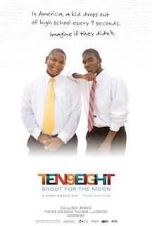
NEW YORK, NY -- Tonal, the original music/sound design house led by Creative Director Alex Lasarenko, continues its long-time commitment to the independent filmmaking community, completing work on three new, highly-touted feature films, including the acclaimed documentary TEN9EIGHT: Shoot for the Moon, which New York Times columnist Thomas Friedman recently called “the most inspirational, heartwarming film you will ever see.” TEN9EIGHT will premiere this month on the BET network.

In addition to TEN9EIGHT, Tonal also worked on the terrifying documentary Cropsey, which was most recently seen in February at the Philadelphia Film Festival; and The Aspern Papers, a modern telling of the Henry James novella of the same name.

''Indie filmmakers all want same thing: for their movies to stand out,'' Lasarenko says. ''That usually means they want to push the envelope musically as well. Each of the films we scored recently is very different, but if there is a unifying theme to them it’s that the music is bold, adventurous and above all memorable.''

TEN9EIGHT:
TEN9EIGHT, produced and directed by award winning filmmaker Mary Mazzio, chronicles the inspirational stories of several teens from low-income communities who enroll in a course at school -- an innovative program that teaches these students how to become entrepreneurs. 24,000 students, from Harlem to Compton (and all points in between) then enter a nationwide business plan competition run by the Network for Teaching Entrepreneurship (NFTE) and what they learn along the way profoundly changes their lives and destinies.

Musically, Lasarenko notes, Mazzio initially wanted an array of musical textures, something to match the lives of each kid profiled in the film. However, Lasarenko felt strongly that in order for the music to be effective it had echo the larger themes of each teen’s journey from despair to inspiration to redemption.

''It was important that the film have some basic musical theme that link each teen’s story in a larger context,'' Lasarenko says. ''I composed a theme for when they describe their low points, another for when they describe the positive change they decided to make in their lives, and yet another when they find success. The challenge was composing these over-arching themes and then creating numerous variations on those themes that coincide with their individual stories.''

Cropsey
A complete 180 from TEN9EIGHT is Cropsey, a documentary by two filmmakers who investigate the mystery surrounding five missing children in their home town of Staten Island, New York and the real-life boogeyman linked to their disappearances. For this, Lasarenko perfectly captures the chilling nature of the story with a simple-yet-haunting, sparsely orchestrated theme.

Although the film is powerful throughout, the most intense sequences occur when the filmmakers investigate the abandoned hospital for the mentally handicapped said to have been the home of the accursed murder. Lasarenko adds to the scary atmospherics by sampling the sounds of screaming, moaning hospital patients heard on an actual Geraldo Rivera television news report from the 1970s where he investigated the hospital for negligence and abuse. Those samples were then used to create an eerie sonic bed for Lasarenko’s music.

''For Cropsey my goal was find out exactly how a melody can be beautiful and evil sounding at the same time,'' Lasarenko notes.

The Aspern Papers
In The Aspern Papers, a modern adaptation of the novella by Henry James set in Venezuela, a young American publisher sets off on a journey to acquire the valuable and original manuscripts of his beloved poet, Jeffery Aspern. There he discovers the poet's ancient muse and her reclusive niece. The American invents a false identity convinced that once inside their house he will get his hands on the precious papers. The tables soon turn though.

''Like the film, the music is journey as well,'' Lasaenko, says. ''In the beginning, the music has lots of movement -- a restless sense, but as he starts to realize he’s being manipulated, the music starts to get simpler and more introspective. I also took the South American setting to incorporate some indigenous instruments such as the quattro, a four-string guitar and numerous percussion instruments. All of which helped capture the mood and sense of place perfectly.'' 


About Tonal:
Founded in 2002 by award-winning composer/sound designer Alex Lasarenko, Tonal is a place where original music and ideas converge in an artistic environment. Clients ranging from advertising agencies, television networks, feature filmmakers and record labels have sought out Tonal for their distinct ability to craft memorable music no matter the genre. Located in the heart of Manhattan’s West Chelsea arts scene, the company’s offices are destination for artists and performers of all stripes from around the globe. For more information about the company visit http://www.tonalsound.com


Web Resources:
For more into about Tonal:
http://tonalsound.com/

For more info about TEN9EIGHT: Shoot for the Moon:
http://ten9eight.com/
http://www.imdb.com/title/tt1519656/fullcredits

For more info about Cropsey:
http://cropseylegend.com/
http://www.imdb.com/title/tt1277936/fullcredits

For more info about The Aspern Papers:
http://www.imdb.com/title/tt1468741/maindetails

February 5, 2010

BOND Edit’s Claudia Reda Walker Cuts International Pantene Campaign Featuring Giselle Bundchen


NEW YORK -- For Claudia Reda Walker, resident fashion/beauty editorial expert at full-service creative post house BOND, every commercial she works on is a chance to add something new, fresh and exciting to the genre. Her latest project -- a nine-spot campaign for Pantene, featuring supermodel Giselle Bundchen, created by agency Wing, New York (a division of Grey Global Group) -- is no exception.

''Working with Creative Director Javier Bonilla and his team is always a joy,'' Reda-Walker says. ''Time after time he brings me beautiful footage, and the Pantene spots were no different. We agreed on an elegant-yet-modern cutting style. ‘Summer’ was particularly fun to cut. Javier trusted me do my own thing. I let the images flow one into the other, using the sun’s natural glares to transition from one shot to the next. The idea was to enhance Gisele’s carefree attitude. The cut had to be effortless and smooth. I opened the spot with just the wave sound to reinforce this.''

In the spots featuring Bundchen, which are targeted to the Brazilian market, we see Bundchen in a variety of settings -- a white sandy beach, a beautiful hotel room, an elegant loft with large stain glass windows. In each spot Bundchen speaks directly to the camera about her hair, its needs and how Pantene Pro V helps keep it looking beautiful. Her testimonial is intercut with glamourous shots of her natural, flowing hair.

Other spots in the campaign target specific markets such as Colombia, Mexico and Argentina, featuring testimonials from models and celebrities from each country. In the ads they talk about their work and how it often means their hair is mistreated, colored, ironed, blow-dried, etc. Thankfully Pantene helps restore it to its natural health, shine and beauty.

Once again, BOND’s full service post approach played a key role with BOND-FX visual effects artist Jeff Spangler adding some digital magic to the star's hair, animating 3D vitamins and enhancing and adjusting numerous scenes.

''Because the spots were not scripted and the women interviewed for hours, the editing challenge was to compress their testimony into just 30 seconds,'' Reda-Walker adds. ''They had to be engaging, informative, interesting and natural and yet deliver the campaign’s message. It took a lot of work to make it all effortless and cohesive.''

About BOND:
From inside their beautifully designed 6,500 square foot studio, BOND (http://www.bondedit.com/) – the creative editorial/post house founded in 2006 by editor Jeff Beckerman – lends its versatile talents to the best in cross-platform advertising and entertainment. They offer clients a full menu of creative services, including editing, graphics, motion effects and sound design/audio post. For more information contact Executive Producer, Stephanie Shayne at stephanie_shayne@bondedit.com or 212-533-9400.

Web Resources:
Click here to watch the new Pantene campaign:
http://clients.bondedit.com/Video/CW%20Pantene%20Summer%20SPA%20ray.mov

Click here for more info about BOND:
http://www.bondedit.com/

Creative Credits:
Client: Pantene
Project: Pro V campaign (9 x :30)

Agency: Wing, New York
Creative Director: Javier Bonilla
Copywriter: Marta Marcos

Editorial/Post: BOND, New York
Creative Director: Jeff Beckerman
Editor: Claudia Reda-Walker
Visual Effects: Jeff Spangler
Executive Producer: Stephanie Shayne

February 1, 2010

Neo-Pangea Reteams with National Geographic Channel To Launch ''The Headshrinker'' Web App


Reading, PA -- To celebrate National Geographic Channel’s (NGC) ''Search for the Amazon Headshrinkers,'' which kicked of the network’s 2nd Annual Expedition Week, Neo-Pangea teamed with NGC to create ''The Headshrinker,'' a versatile web application that allows users to upload any photograph (your boss, your mother-in-law, that shifty cousin who owes you $50…) and transform it into a realistic-looking 3-D shrunken head.

From there, users can customize their creepy creation by choosing from four different head shapes. They can add different accessories including bones, braids, and jewelry. They can also change the color of their shrunken head’s hair or add facial hair to match their own, or create some crazy-freak-alien-hybrid. To further accentuate the experience, users can select from Amazon-inspired environments and different types of background music. They can then share their morbid masterpiece through e-mail, embed on their Facebook wall, or shout to BFFs on other popular social networking sites like Mixx, Twitter, Digg, Delicious, reddit, and MySpace.

__________________

To try “The Headshrinker” for yourself, visit http://www.natgeotv.com/headshrinkers
__________________

''We really had a good time with this one'' said Neo-Pangea Creative Director Brett Bagenstose. ''In fact, the creations turned out to be far more bizarre than we had originally intended. Once we started rotating the images to put the picture’s eye or nose where it’s mouth is supposed to be, it opened up a whole new world of gross opportunities. And yes, I enjoy having a job where a ‘gross opportunity’ is a good thing.''

''The Headshrinker'' is the latest collaboration between Neo-Pangea and the National Geographic Channel. Their first joint effort, ''The Aftermath” timeline, earned Neo-Pangea a National Addy Award.

''National Geographic Channel offers such diverse and interesting content, that partnering with them is always an exciting challenge,'' Bagenstose continued. ''Working with Nat Geo, we’ve had an opportunity to imagine what the end of the world would look like and what our intern would look like with his eyes stitched shut. I can’t wait to see what we’ll get to imagine next.''


About Neo-Pangea:
Neo-Pangea is an innovative digital agency that specializes in digital video production, Web design, 3D design, interactive experiences, and live-environment multimedia.  It has created successful promotions for Fortune 100 brands across the globe such as the National Geographic Channel, Comcast, and Wal-Mart. For more information, visit http://www.neo-pangea.com.


About National Geographic Channel:
Based at the National Geographic Society headquarters in Washington, D.C., the HYPERLINK "http://www.natgeotv.com/" \t "_blank" National Geographic Channel (NGC) is a joint venture between National Geographic Ventures (NGV) and Fox Cable Networks (FCN).  Since launching in January 2001, NGC initially earned some of the fastest distribution growth in the history of cable and more recently the fastest ratings growth in television.  The network celebrated its fifth anniversary January 2006 with the launch of NGC HD, which provides the spectacular imagery that National Geographic is known for in stunning high-definition. NGC has carriage with all of the nation's major cable and satellite television providers, making it currently available in nearly 70 million homes.  For more information, please visit http://natgeotv.com/.

January 21, 2010

Calabash Animation’s Short Film, ‘’Botnik’’ Wraps Up Film Festival Run


CHICAGO, IL – ‘’Botnik,’’ the animated short produced by Calabash Animation and directed by Calabash’s Jacqueline Smessaert-Brennan wrapped up its film festival run at the end of 2009 with appearances at Filmstock in Luton, UK; Tallgrass Film Festival, Wichita, KS; and the Ojai-Ventura International Film Festival, Ojai, CA.

In the last few months “Botnik” appeared at Comic Con Independent Film Festival, San Diego, CA; Raindance Film Festival, London; Valley Con, Fargo, ND; LA Shorts Fest, Los Angeles, CA; and Temecula Valley Film and Music Festival.

“The last year has been an amazing learning experience for me,” Smessaert-Brennan says. “We’ve met with some amazing people who love the film and have encouraged us to keep pushing forward with it. Now that we’re nearing he end of our festival run we’re looking forward to pursuing any and all opportunities for ‘Botnik.’ Our goal remains the same as when we started: to get the film seen by as many people in as many mediums as possible, which includes TV, DVD, web, mobile, airlines and beyond.”


“Botnik” highlights from ’09 include:

Winning at the Palm Springs International Film Festival in the category of Best Animated Short;


• Being accepted into Comic Con, and serving on a panel with acclaimed animator Bill Plympton and several notable others;


• Meeting with Matt Groening (creator of “The Simpsons”) at Comic Con, which resulted in a screener request from FOX Television.

Written and Directed by Smessaert-Brennan, ’Botnik’’ is a ten-minute cel/digital animated short that tells the story of a frustrated wannabe artist who longs to make the scene with resident hipsters and win the heart of a beautiful beatnik girl. Thwarted by a crushing combination of creative block and pressure to produce, he retreats to his retro-laboratory and emerges with the solution: a gleaming robot artist programmed to create the ultimate art show.


According to Calabash Creative Director Wayne Brejcha, ‘’Botnik’’ represents the company’s most ambitious film production to date and came about thanks to Calabash’s internal film program that encourages staff animators to submit film ideas with the best one being produced. The program began in 2001 and was an immediate success with its first short, ‘’Stubble Trouble,’’ receiving a 2002 Academy Award nomination. Since then the company has produced five animated shorts, all of which are available on the company’s website.


‘’We are extremely proud of ‘Botnik,’ both from a creative and an execution standpoint,’’ said Brejcha. ‘’It’s complex in terms of the story and animation technique, and we look forward to sharing it with the world on the film festival circuit and beyond.’’


About Calabash Animation:

Led by Creative Director Wayne Brejcha and Executive Producer Sean Henry, Calabash Animation, Inc. (www.calabashanimation.com) is the Chicago, IL-based animation production studio, known for its award-winning cel, 3D and stop-motion animation for the advertising and entertainment industries. Calabash Animation is perhaps best known for their creative development of some of America’s most beloved brand icons. In addition to working on some of today’s top advertising the company has also produced several acclaimed short films. It’s 2002 short ‘’Stubble Trouble’’ was nominated for an Academy Award in 2002. Its most recent “Botnik” will hit the festival circuit in Fall 2008.


Web Resources:

Click here to view the trailer for Calabash’s short ‘Botnik’

http://www.calabashanimation.com/movies/view.asp?file=botnik_trailer.mov


Click here to visit the Calabash website:

http://www.calabashanimation.com


Click here for more info about ‘Botnik’

http://www.myspace.com/Botnik_2008

http://www.imdb.com/title/tt1362368/